Experience
How the New trivago Logo and Brand Identity Came to Life
At the beginning of 2023, we kicked off a big project to update our logo and brand identity. In under a year, our fresh logo and brand expression took shape. Want to know the behind-the-scenes story? We chatted with Design Lead Katharina Frerich, Brand Manager Sandra Knezevic, and Brand Management Lead Maria Bonerz to learn more about the project.
What inspired the decision to develop a new brand expression for trivago?
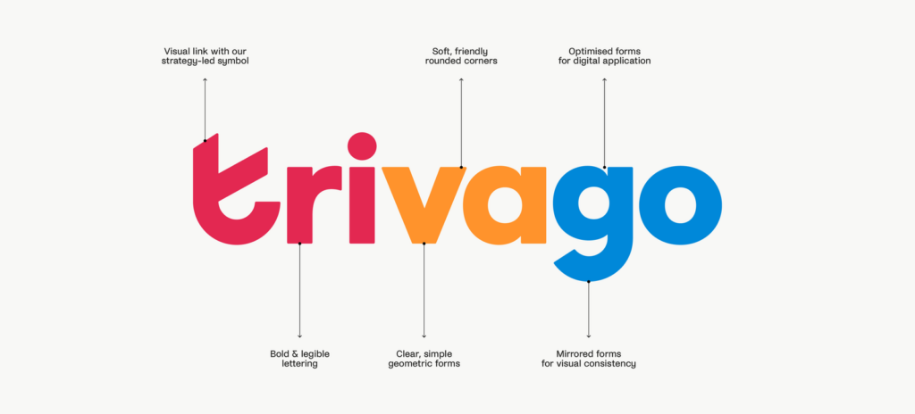
Sandra: In a world of strong competition we wanted to shape a stronger brand role and build a more consistent customer experience to increase our potential to retain users and acquire them more efficiently with a more distinct and memorable brand strategy and expression. The logo – an essential part of the new brand expression – offers the possibility to use the first letter of the wordmark as a standalone, iconic symbol to increase recognition and memorability, as symbols are processed and remembered faster and more easily.
Maria: Brand development always starts with a clear strategy as foundation. A strong brand is not only important consumer-facing, it’s also an anchor point for strategic alignment across a company and a common corporate identity and culture. So it was really important for us to look at our existing strategy and expression to see how we could make it super clear and helpful for different functions across the company, especially marketing and product. We also consulted with the culture team and advertiser relations. For me personally, it was really important that we added a brand promise to our strategy elements – a simple statement that guides the experience we want to build for our consumers and sparks ideas on how we can further set ourselves apart.
Can you explain the meaning behind the new logo and brand expression and share what was the inspiration for the new design?
Maria: Historically, our brand expression was guided by the product. This imposed strict limitations on our creatives and we were simply missing an adequate set of tools to make our brand memorable and our communication stand out. We have a very vibrant, exciting culture and wanted to reflect that positivity and excitement more in our external-facing brand.
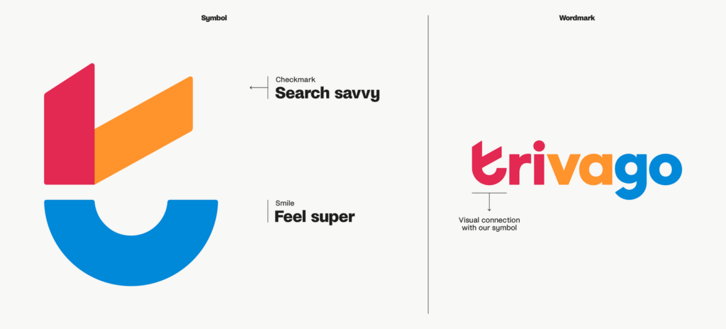
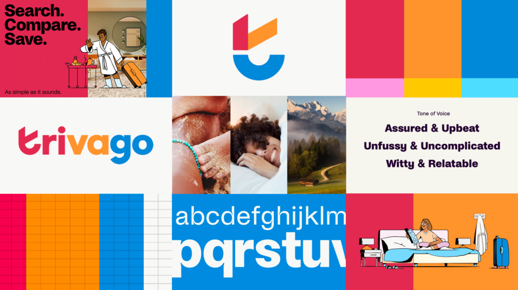
Kathi: The stylized symbol doubles as a checkmark, representing a smile that refers to our new brand promise “Search savvy. Feel super.” This tells the story of our user who successfully used our product and feels good about it. The brand expression is very playful, but also simple. The usage of new brand elements like the illustrations, a strong and vibrant color palette, or an inspiring photography style makes it very exciting.
Sandra: Our goal was to create a simple design system that heroes our warm and witty tone of voice. Our bold logo is the beacon of the brand and includes the symbol which is made up of a checkmark to represent “Search savvy”, and a smile which reflects the trivago experience of making travelers “Feel super”. This is supported by a customised contemporary and characterful font – Savvy Grotesk.
The witty and characterful nature of the brand is also brought to life through playful hand-drawn illustrations, created in partnership with Niceshit.
The illustration is complemented by photography that captures the feeling of finding a great deal and is used to tell stories, inspire travelers, and highlight trivago’s benefits.
Can you share more about the project, how it started, how long it took to implement the new design, and who was involved?
Sandra: The preparation for the project started in 2022. It took quite some time to align on it with all stakeholders (including Product and the Leadership team), get it signed off, and define the exact challenge, expected outcome, and scope.
We got in touch with agencies to support on the project around February/March 2023. We had several agencies pitching for us, and the selection and contracting also took a while. Finally, at the beginning of June last year, we onboarded our partner agency, Design Studio.
The whole project involved a lot of stakeholders across the whole company (Product, Leadership team, Consumer Insights and Measurement team, Strategic Business Development, Creative Production etc.), but we kept updating even more leads and teams along the way.
For the implementation part (focus on swapping the logo across all touchpoints) we had a channel with more 50 stakeholders across the whole company!
What challenges did you encounter and how did you deal with them?
Kathi: For me, the main challenge was to align with all the different stakeholders and make decisions with many teams involved. It’s not easy because everyone had different requirements and a different vision of our future brand. The expectations on ourselves were very high, and we wanted to achieve a result we can be proud of. High expectations are good and necessary to go above and beyond, but they can also create a lot of pressure and doubts. There are so many amazing brands out there that it’s sometimes easy to lose focus, but in the end, it’s about finding the right path for our brand to make it unique.
Sandra:I could highlight few different challenges:
- Probably one main challenge was to align with all different stakeholders and make decisions with a lot of different teams involved. We had to communicate openly with all the teams involved.
- Another challenge was finding the sweet spot: The project was meant to be an evolution, not a revolution, however the new expression should still feel new and distinct, and ideally include a new symbol (while keeping the wordmark) that was currently missing in our toolkit. We had to keep reiterating and always double-checking with our criteria. (Maria: I could add here that developing evaluation criteria for each step was critical to guide discussions and not lose focus on what was really important.)
- Finding the right ingredients for our toolkit that could really set us apart within the category and help us own our content.
- Watching out that every output for the brand expression matched our evaluation criteria (reinforcing this in feedback rounds and using the criteria for evaluation).
These were our evaluation criteria:
- memorable – easy to perceive and process (simplicity over complexity)
- stand out – as unique as possible within the category
- build to last – easy to implement both from a product perspective and across media channels + not dependent on current design trends + not dependent on agency support / easy to implement in-house
- accessible – still processable for people with e.g. color blindness
- encapsulate spirit of the new brand strategy
What is the biggest learning you have gained from working on this big project?
Kathi: You can’t please everyone, but if you have a strong vision and a good reasoning, it’s worth it to go through such a big process.
Sandra: Agree with Kathi here 😊
Can you highlight any memorable moments or milestones in the journey of creating the new brand expression?
Kathi: One milestone for me was to first see the different concept routes Design Studio created. It was very exciting to see how trivago could look like in the future. Another milestone was to get an approval for the new logo!
Sandra: Signing off the new brand promise “Search savvy. Feel super.” and seeing how this sparked the development of the brand expression was a true highlight for me. Another memorable moment was signing off the new symbol and wordmark, which was quite a journey, and revealing it to the whole company. And of course, seeing the first explorations for execution (first OOH examples, social ads etc.) really bringing the brand expression to life.
Thanks to Kathi, Sandra, and Maria for sharing their insights!
In December 2023, we began implementing changes, starting with updating the logo and adopting our new brand identity, as our new advertising campaigns gradually rolled out across markets. It marked an exciting new chapter for us, and we look forward to the future of our brand adventure.


